I am back from vacation and happy to be with you all! I hope you were able to take some amazing vacations and make some memories this summer. My topic for today’s episode is rustic design, and I’ll share my thoughts about that trend before digging into the mailbag.
This episode, I discuss…
[4:24] The definition of rustic design
So many of my clients ask for rustic designs. You might think rustic designs would be out because it’s been hot for so long. I really thought we would see it tapering, and it might be to some extent. I decided to look up the definition of “rustic” because I thought that would give us a good starting point for today’s conversation.
According to the dictionary, “rustic” is one of two things: relating to the countryside/rural, or made in a plain and simple fashion. I think the second definition is much more in line with how I design for a client who says they want rustic. I think of country style as a separate thing, but when I think rustic I think of the actual quality of a piece. I want to see wood grain. It doesn’t have to be perfect, but it has to feel authentic rather than overly finessed. It’s almost handmade, or roughly finished so that you can clearly see the material. It’s not covered up with a lot of finishes, lacquer, or polish.
[6:10] Pitfalls with designing in a rustic style with clients
The first pitfall, I touched on a little bit earlier. I think that rustic, as a style, is not going to have a ton of longevity in interior design. It’s a bit trendy to want to see a lot of wood grain. I think that people are eventually not going to want to have live edge wood tables, where you can see the shape of the tree, where you can get a splinter if you rub your finger the wrong way on the table. Those live edge wood tables, rough burlap, or super open weave linen – I think they are going to go out of fashion in the next four years.
I have seen this rustic style evolve. Three years ago, everybody wanted “industrial”. Clients were clamoring for industrial design. Now they want many of the same pieces and aesthetic, but they started calling it “farmhouse”. That visible wood grain was still popular, but maybe it would be a gray or white wash. Before industrial, it was “shabby chic”. It’s the same idea of items that look a bit worn, where you can clearly see the material underneath, but it’s actually old or antique. I feel like this style has been around for years, but the name keeps changing.
I think this “rustic” name is going to change again soon, so I want to put that out there as a warning for anyone looking to do a renovation. Be it a wide planked floor, be it whitewashed shiplap, be it metal that looks hand forged, these are all elements that may be dangerous to incorporate in a renovation. You want to make sure you’re incorporating the rustic style in elements that can be easily swapped out once the trend is over.
[9:22] Helping rustic style to work better in everyday life
First, it can be helpful to incorporate glass. Glass is not usually a texture that’s associated with “rustic”. People tend to think more of metals, woods, and even fabrics before glass. When you have a room, however, that has a lot of metals, woods, and even stone, it can feel very heavy and bogged down. I love the idea of lightening it up with glass. Also, as you know from previous episodes, I like to think about materials I haven’t used yet. If i’ve used a lot of those heavier materials in a room, glass can be a really nice way to make the space feel more complete and balanced. If you are looking for a more rustic glass to fit in with this type of room, check out mercury glass or seated glass that has those tiny air bubbles.
We also want to make sure that this rustic style doesn’t get too cold or hard feeling. It is important to balance the space with soft and hard elements. Don’t forget textiles like burlaps and linens, and also that you can create softness with colors. Soft colors are more muted and pastel. Instead of going for a cherry red, maybe go for a blush pink. Instead of going for a really intense navy blue, maybe go for an aged or worn denim. So there are ways to make a space feel warmer and softer in a rustic design, which is typically a neutral look. There are ways to make it more lively and approachable while staying within that oh so popular rustic style.
[13:33] Mailbag note: German rental traditions regarding kitchens
Sophie from Germany writes:
Betsy, I love listening to your podcast. It’s packed with practical, but also inspirational, ideas and it also never fails to lighten my mood. However, listening to your episode on inner architecture, I was a bit surprised. I’m from Germany, and there seems to be a bit of a misunderstanding when it comes to our rental traditions. You don’t rip out the bathroom, or just in case you want to get in a lawsuit with your landlord, maybe you would. But yes, rentals often don’t come with a kitchen as part of the rental agreement, but it is pretty standard to buy your kitchen from the previous renter for a fraction of the price of a new kitchen. You get tons of secondhand kitchens via our equivalent of Craigslist. If people take the kitchen with them, it’s usually not to throw it away. Instead, they take it to their new place. For a lot of kitchen cabinet series, you can buy additions even after decades. So, this is also what happens when you’re talking about light fixtures. I just wanted to set this straight, so you don’t imagine Germany being a country covered in a landfill of kitchen cabinets when indeed most people reuse the same kitchen for twenty years or more.
Sophie, thank you for setting me straight. I think it’s so interesting to think of ripping out the kitchen and taking it with you every time you move. I moved once every year in New York City, and I think I lived in no fewer than nine apartments. Even thinking about moving houses like I’m planning to do right now, the idea of ripping out my kitchen and having it fit in a new space with a different look is so foreign to me. I would want to design something new for my new space. Thank you again for this perspective!
And I answer a question about…
[15:54] Considerations for tiling behind the vanity in a master bathroom
Griffin from Charlotte, NC writes:
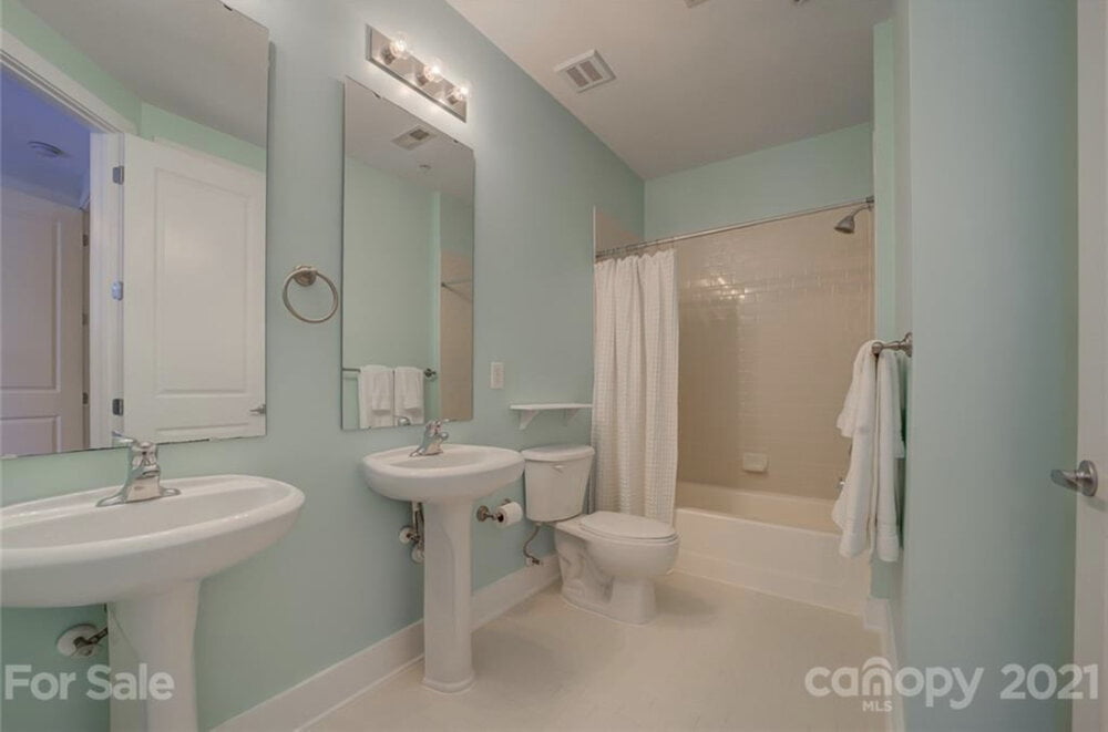
I’m thinking about tiling half of the wall behind the vanity in my master bathroom. Any considerations for the tile? I am thinking color!
There is a picture of the bathroom with mint colored walls, double sinks, two mirror, and a white shower. It looks like there is white subway tile in the shower. I definitely think this bathroom could benefit from a little bit of pizzazz, and the idea of putting tile on the walls is a good one.

I wouldn’t go all the way up the walls in this particular bathroom, because there is a lot of wall space. I don’t mind fully tiling a bathroom from ceiling to floor when you have a smaller space, but sometimes when you put tile all over a relatively large bathroom, it can feel oppressive. When it goes all the way up, there are no opportunities for artwork. Additionally, if you want to drill in a towel bar, its holes will remain in the tile. In sheetrock, you can patch the holes. So, you’re really limiting yourself when you tile all the walls.
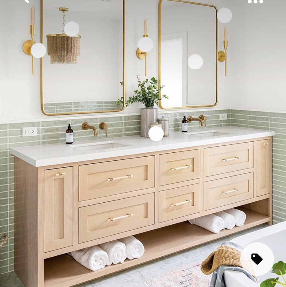
When designing a bathroom, I advise you to go between 34-54 inches high with that tile. The average is 36 inches high for wall tile. In Griffin’s case, there are mint colored walls. Green is not my favorite color in a bathroom because it casts a sickly pallor on your skin. If you’re doing makeup in there, if you’re looking at yourself in the mirror and exposing a lot of skin, you may not look your best in a green bathroom. In my opinion, I would paint the walls in a neutral color. Color can certainly be incorporated into the room with tile.

In Griffin’s inspiration pictures, you can see this beautiful hand-glazed, elongated, olive green tile. It is really fetching, especially with that stark white grout that really brings it to life and ties in with the white vanity countertop. It’s a beautiful tile, and it won’t cause a significant pallor if you don’t tile all the way up the walls.
In the pictures, you can also see that everything else in the bathroom is pretty neutral. There is a light colored floor, and white or cream subway tile, shower curtain, pedestal sinks, and toilet. All of these things might technically say “white” on the label, but when they are all put side by side they don’t exactly match. I try not to do white on white on white on white, whether I’m designing a kitchen or a bathroom. Unless they are perfectly matched, everything ends up looking a bit off.
Links:
Website:
Book:
https://www.betsyhelmuth.com/my-book
Become a Premium Member:
https://affordableinteriordesign.com/podcast
Submit Your Questions:
https://affordableinteriordesign.com/podcast
Instagram:
https://www.instagram.com/affordableinteriordesign
Facebook:


