
We’ve all been there—standing in the middle of a room, staring at it like a puzzle we just can’t solve. Why doesn’t it look quite right? Interior designers know the answer: those sneaky little decorating crimes that quietly throw everything off.
But here’s the good news—you don’t need a design degree to avoid them. From hanging your artwork at the perfect height to creating layered lighting that flatters every corner, these 10 tips will have you decorating like a pro in no time. Ready to see what’s holding your space back? Let’s get into it!
1: Furniture Lining the Walls
Think of your furniture arrangement as a conversation—not everyone should be shouting across the room. Lining everything against the walls can make a space feel disconnected and cold.
The Fix: Float your furniture! Bring sofas, chairs, and tables inward to create a cozy, functional arrangement. Use a rug to anchor the layout and give the room a polished look.
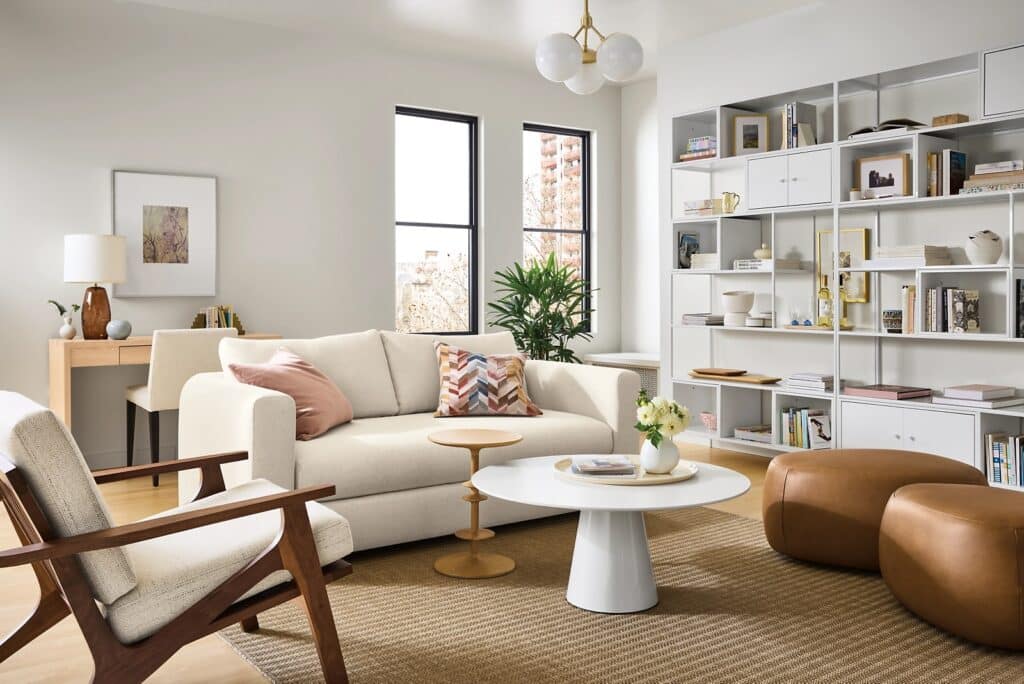
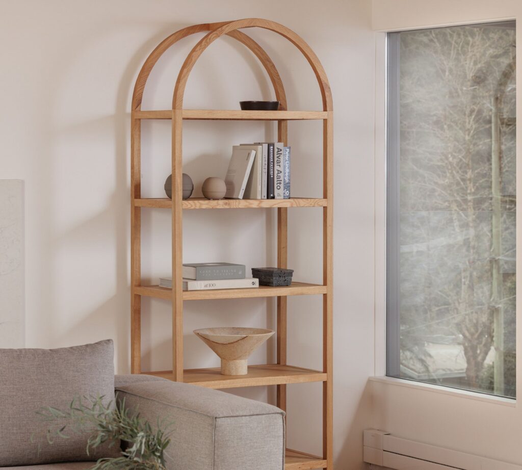
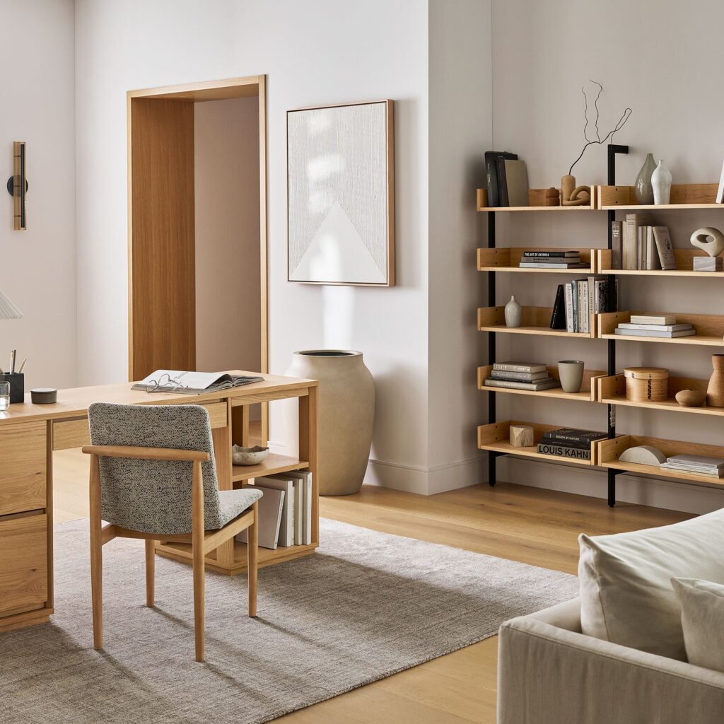
2: Overstyling Shelves
There’s a fine line between curated and cluttered. One of the most common decorating mistakes is stuffing shelving with knickknacks, books, photos, and keepsakes. Shelves piled high with decor can feel chaotic, while under-styled shelves just look neglected.
The Fix: Use the “rule of thirds.” Group items in odd numbers, mix heights and textures, and leave breathing room between pieces. Balance is key to a chic, intentional display.
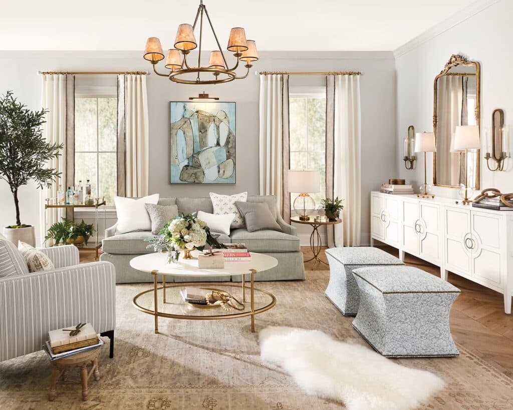
3: All-Matching Furniture Sets
Buying a pre-matched set of furniture may seem like the easy route, but it’s a decorating mistake that leaves your room looking flat and uninspired—like you ordered a page out of a catalog. Especially when you buy an entire matching bedroom set. Boring! Your space won’t look curated if you choose coordinating sets.
The Fix: Mix and match! Designers look for things that go together but never came together. Pieces should coordinate effortlessly but not look the same. Good design needs contrast.
4: Not Layering Lighting
Relying on a single overhead light isn’t just harsh—it’s a design mistake that’s a missed opportunity to make your space shine. What good is a gorgeously designed room if you can’t see when you’re in it?
The Fix: Layer your lighting and never rely on overhead lights to illuminate a room. Floor lamps and table lamps create warm pools of light that brighten the different zones in a room. Every room (besides the kitchen and bath) needs a minimum of three lamps dispersed around the space to create an inviting, well-lit environment.
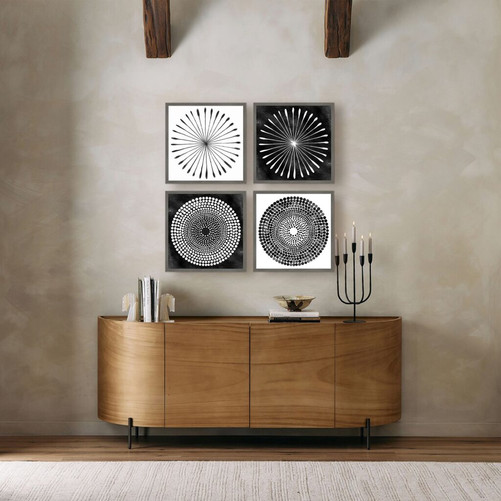
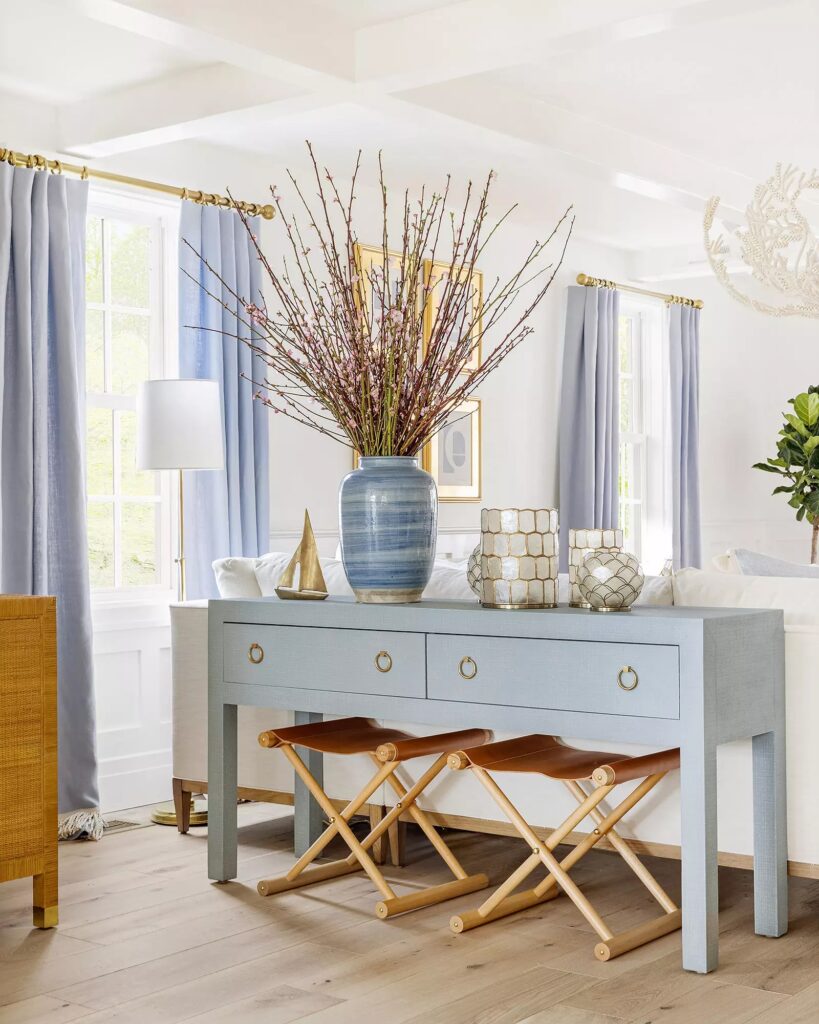
5: Hanging Artwork Too High (or Low)
Art that’s hung too high (or low) looks awkward. No matter the height of your ceilings, there is an art (see what we did there) to hang artwork at the right height.
The Fix: Always hang art at eye-level. We recommend using museum height: 60″ from the floor to the center of the piece. For two pieces above one another, hang so the center point between them is 60″ from the floor.
When hanging artwork above furniture, put 4-14″ between the top of the furniture and the bottom of the piece:
- 8-12″ above a sofa
- 4-8″ above a bed
- 7-14″ above a computer desk
For dining areas put the dining chair against the wall and hang art 3-6″ from the top of the chair to the bottom of the art.
For any other pieces (piano buffet, credenza, dresser, etc.) go for 4-7.”
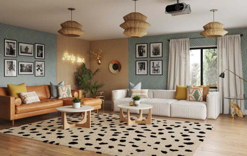
6: Going All-In on One Design Style
Nobody wants a home that feels like it was ordered from a single Pinterest board. A strict theme can make your space feel predictable and lack personality.
The Fix: Blend styles for a layered look. Pair mid-century modern furniture with boho textiles, or add a vintage piece to a contemporary room. Mixing eras and influences keeps your space dynamic.
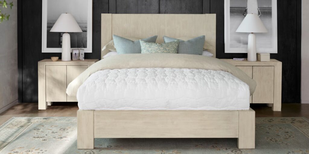
7: Nightstands That Are Too High or Too Low
A nightstand that’s the wrong height is a design mistake that can throw off the balance of your bedroom. Nightstands shouldn’t be the focal point of the space (that honor goes to your bed), but they should be attractive and styled. If they’re too high or too low it will make the room look awkward.
The Fix: Measure from the floor to the top of your mattress and choose a nightstand within 2 inches of that height—either slightly taller or shorter works. Bonus tip: Your nightstand lamp should also be within 2 inches of the height of the surface it’s on for a cohesive and functional look.
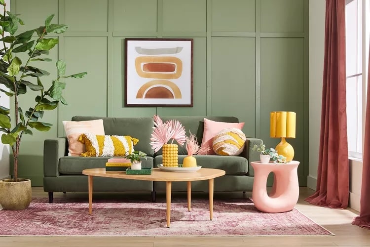
8: Sticking to One Accent Color
One pop of color can fall flat—it’s the visual equivalent of a single note in a song. Using an accent color in equal amounts throughout a room is expected and formulaic.
The Fix: Follow the 60/30/10 rule: 60% of your room should be a main color, 30% a secondary color, and 10% an accent color. The layers create depth and harmony.
9: Skimping on Details
A beautiful room without finishing touches is like a cake without frosting—it’s fine, but it’s missing the wow factor. A big decorating mistake that is easy to solve.
The Fix: Style media consoles, coffee tables, and shelving with objects that reflect your personality. A stack of books, a decorative tray, or even a small sculpture can pull everything together.
10: Overdecorating or Underdecorating
Too much decor can feel chaotic, while too little can leave a room looking unfinished. As you’ve probably guessed by now, great design is about balance. No one wants to live in a cramped space, and neither do you want to live in a sterile one.
The Fix: To avoid this decorating mistake, start with a few larger pieces, then layer in smaller accents. Less is often more, so don’t be afraid to edit as you go.
The secret to great design isn’t about spending a fortune—it’s about getting the details right. By avoiding these common decorating mistakes, you can create a home you love that’s designer-approved.
Feeling stuck? Our team of expert designers is here to help. Book a consultation today, and let’s make your home everything you want it to be—without the guesswork.