It has been a rough week here, as my storefront has undergone some serious water damage. The silver lining, however, is that we are rebranding and I’m excited to share that as well as our new social media platforms. Interior design is a visual medium, and it will be nice to share pictures and video clips on YouTube, Facebook, and Instagram. All of that will be ramping up soon, so stay tuned!
This episode, I answer questions about…
[7:37] How to make a new build home feel relaxed, organic, and not so “new” (Bailey, Arizona)
Question:
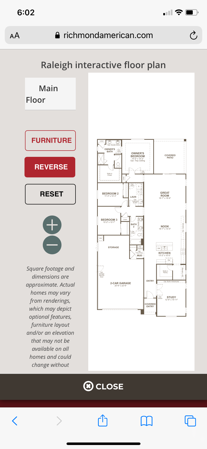
Our new build in Arizona is about done, and I am so excited to start designing. I’m hoping to make our new home feel not so new. I love the organic, relaxed feel of the Spanish colonial design. Our home is an HOA, so I don’t have much say as how to personalize it with arches and such, but we do have white stucco on the exterior. I’m wondering if you have any tips or tricks to achieve the relaxed, organic, Spanish colonial vibe. I’ve attached a picture of the floor plan. I plan on starting with the study and the powder bath, where the walk-in pantry is in the picture. The study will be more used as a family room and reading nook for now.
Answer:
Spanish colonial is epitomized by stucco, terracotta tile roof, and wrought iron, but there are many ways to contemporize it and make it feel more fresh. One suggestion is to incorporate muted jewel tones. It can be a really nice way to add a pop of color without it being too in your face. I would opt to lean into more of an aged old world color scheme, while also introducing some patterns to give it a contemporary twist.
Another way to make Spanish colonial feel fresh is to incorporate other textures. This strategy works for any style, because contrast is king when you’re designing. So think about woven textures, like maybe a jute rug or chunky baskets. Think about macrame in terms of bringing in a different type of fiber and maybe using it as a wall hanging rather than something really austere, like a framed canvas.
I also love black and white in a Spanish colonial space. It can play off the architecture in terms of that dark wrought iron metal with the white stucco, but it does it in a more playful and interchangeable way. If you get tired of an X pattern, for example, you can switch it out and do something more black and white southwestern. Another option would be to use seeded glass in an entry fixture or pendant. Seeded glass and wrought iron together incorporates lots of different textures. I would also want to think about incorporating some softness, because stucco, wrought iron, and wooden beams can feel cold and uninviting. Softening that with drapes, rugs, and fabric wall hangings, are all ways you can make that hard edge architecture more soft and inviting.
Of course, I would also add plants. Oftentimes these spaces are devoid of a lot of wood. They may have tile floor rather than hardwood floor. So bringing in elements of nature can also help the home to feel more contemporary and fresh.
[13:03] Where to buy printed sheets for kids (Ashley, North Carolina)
Question:
In one of your podcasts, you talk about liking printed sheets for kids’ rooms. Where do you recommend buying printed sheets for kids? I’m looking for crib sheets and queen sheets for nursery and my kids’ rooms.
Answer:
I used to only like white sheets for adults and printed sheets for kids, but sometimes I like to do something more interesting. So after picking out so many white sheet sets for my clients, I’m really loving pattern play in my own life. I’ve been picking sheets that have chevrons and other interesting graphic patterns. I have really been loving the mix, and I also like that when I change my sheets I change the vibe of the room. It’s a mini transformation every couple of weeks when I change my sheets out.
So I have softened and now I don’t just like printed sheets for kids’ rooms; I love them for adults’ rooms as well. I will often still go for white sheets for my clients just because they are so versatile, I personally have three different sets of printed sheets that I love.
As far as where to buy them, I love Pottery Barn Kids and Pottery Barn Teen. I use them all the time for my own kids, and sometimes I even buy for myself as well. I also love Crate Kids (formerly the Land of Nod division from Crate & Barrel) The Company Store, and Target for bedding. If you don’t want to break the bank, but want to play with a variety of patterns, all of those places are my favorite places for kids’ sheet sets.
[17:29] How to lay out the furniture in a living room with the fireplace in the corner (Brandy, Colorado)
Question:
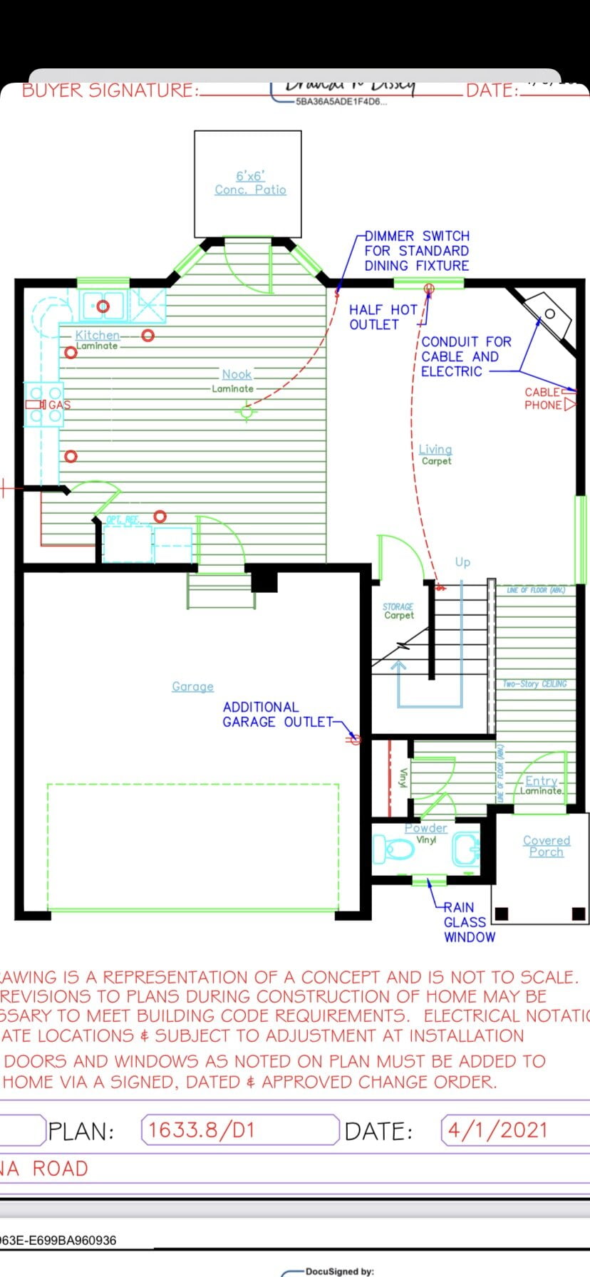
I know you aren’t crazy about layout questions on the podcast, so I’m not looking for a specific direction. I just want some general ideas. My husband and I are building our first house and attached you’ll see the living room. We weren’t given a choice to send you the fireplace. So the fireplace is in the corner of the room. How would you lay out the furniture in a living room with the fireplace in the corner?
Again, these are just general ideas. I’m fine without specifics. The whole house is 1633 square feet. The living room is not that big. So while there is space above the fireplace for a TV, it won’t be far enough away to not crane your neck when watching to the right of the fireplace. We could place an entertainment unit, but it could make the focal point of that room, the fireplace and the TV, seem a bit cluttered. Which is the lesser of two evils for you?
Answer:
I don’t generally weigh in on a floor plan on the podcast, only because I like to do my due diligence and try every possible option. That being said, I do have general thoughts on what works best when laying out a space like this. I work with small living rooms frequently, both in Manhattan as well as in older homes in the suburbs.
In my own home, I have a living room that is a generous size but not deep. It is long and narrow. So I feel your pain when it comes to having it be awkward to have the TV over the fireplace. In our living room, there wasn’t much of an option in terms of where to put the TV so we did mount it above the fireplace, but angled it down. Think of a sports bar or a hospital room where the TVs are higher than they should be, but they’re on an angle so it doesn’t feel like the front row of a movie theater.
That said, if you really don’t have good depth and if it is going to feel uncomfortable to watch TV even if it is angled down, then I would not put it above the fireplace. I don’t want that wall in the living room that has the fireplace on it to start feeling to heavy or bulky, so what I might think about instead is using a television stand rather than an entertainment unit. You could also use a smart TV, so you could mount the TV and sync the wires in the wall so no stand would be necessary.
Typically when you’re seated on the main piece of furniture, just a few rules of thumb to keep in mind are that you want to have good feng shui. So from that main piece of furniture, in this case it would be the sofa or a sectional, you would want to be able to see the main walkway, the main point of access, where people are most likely coming and going.
If you’re feeling like the TV and the fireplace just aren’t going to work on the same wall, you could also incorporate two focal points – the fireplace on one wall and the TV on another wall. Ideally, those walls would be perpendicular to each other, so I would use a sectional on the other side. Then I have two arms of the sofa and each arm is looking at one of the focal points. That would be a really nice way to distribute focal points without having to turn your neck to see one or the other.
Links:
Website:
Book:
https://www.betsyhelmuth.com/my-book
Become a Premium Member:
https://affordableinteriordesign.com/podcast
Submit Your Questions:
https://affordableinteriordesign.com/podcast
Instagram:
https://www.instagram.com/affordableinteriordesign
Facebook: