I’m in a celebratory mood! September holds a lot of meaning here at Affordable Interior Design. It’s back to school time, and it’s also my anniversary. I celebrated my personal anniversary with my husband of 11 years, and our anniversary happens to be September 11th. So as a New Yorker, this date has extra meaning. It was 9/11 that spurred me to become an interior designer. I also celebrated my business anniversary – it’s my 16th anniversary of being in business. I still can’t have a big celebration due to the pandemic, so I’m celebrating in a small way. It’s me, my dog, and the podcast listeners. It’s really easy to miss the wins because you’re so busy with the to-do list, so thank you for indulging me as I celebrate this win.
I also want to celebrate that I get to help you guys by answering your questions. Please send me your questions at affordableinteriordesign.com/podcast . I’m always excited to help you!
This episode, I answer a question about…
[14:31] To paint the ceiling, or not to paint the ceiling (Griffin)
Question:
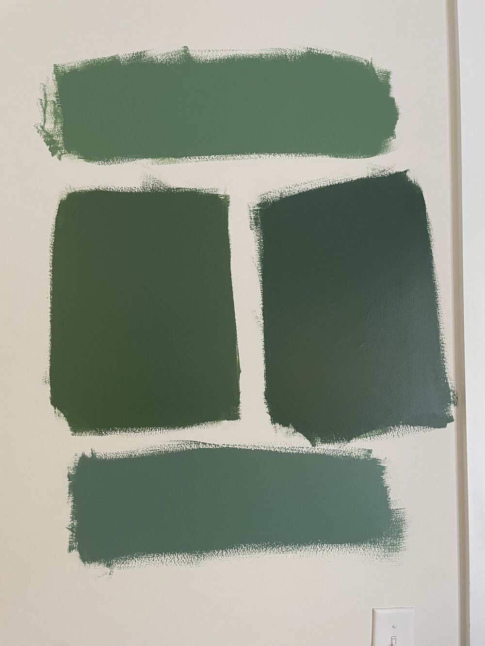
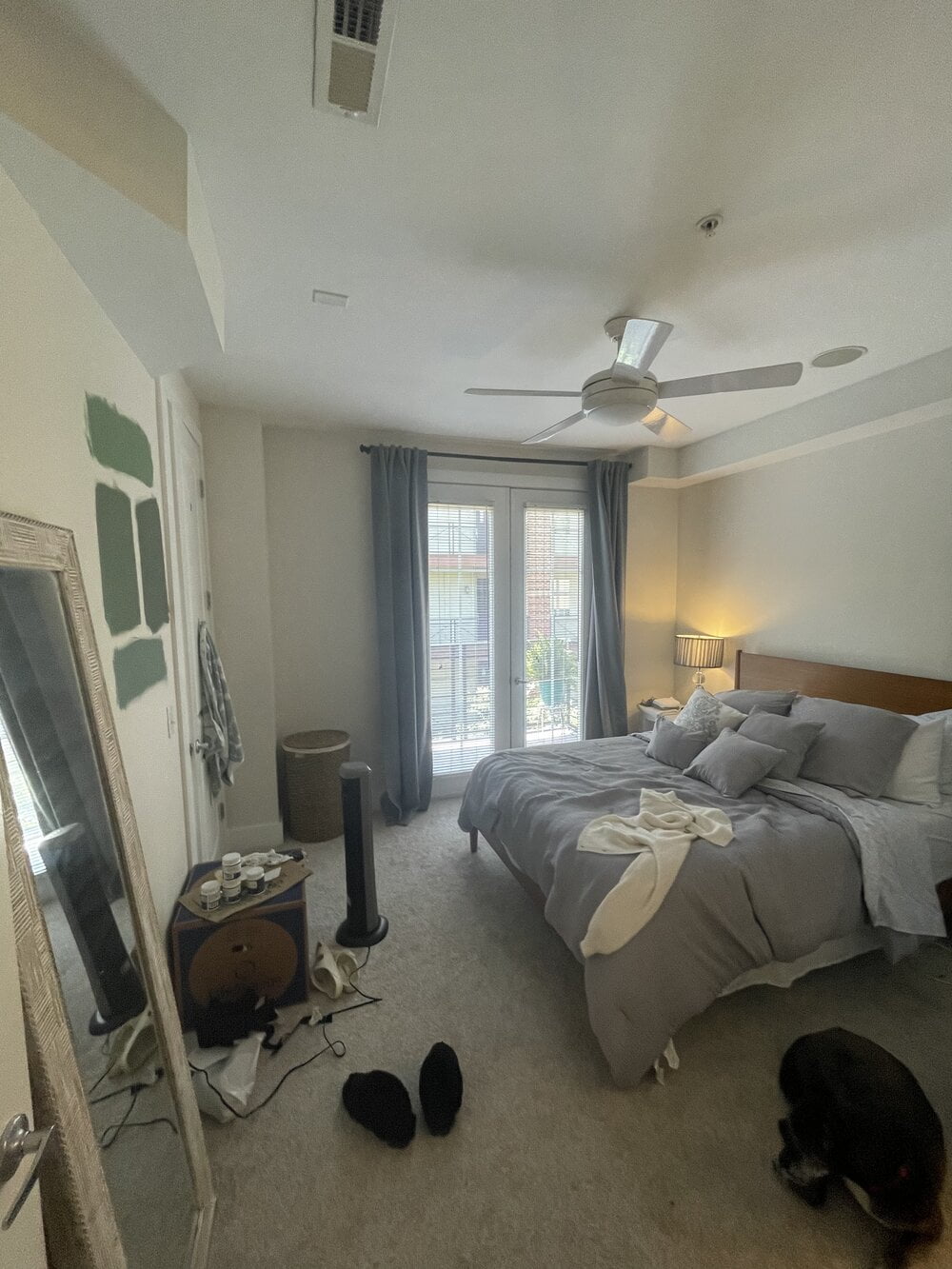
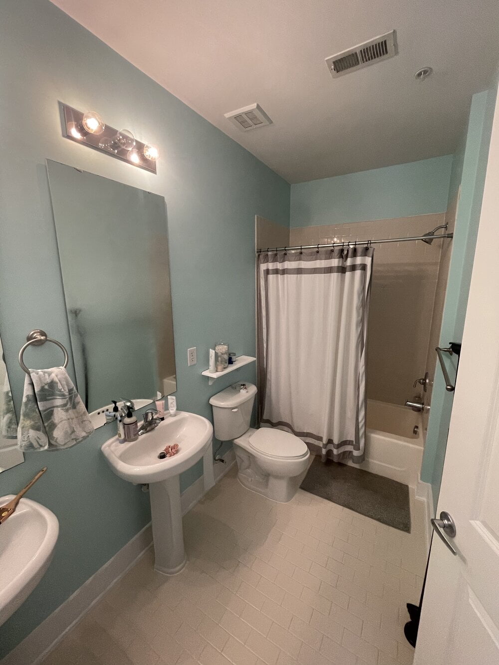
We moved into our new home last week and we are looking to paint the master bedroom and bathroom. Our two-word phrase is “cozy mid-century”. We want a moody feel in our master suite. We’ve chosen the darkest green on the left for our bedroom and the blue-green on the bottom for our bathroom. I’m just not sure how to treat the ceiling and either of those rooms. I’m hesitant to keep it plain white, but my boyfriend has an issue with painting the entire thing dark green. What are your thoughts?
If it’s just a powder room, doing a forest green or even a deep teal can be gorgeous. But if I’m going to be checking myself out or applying makeup, it’s not going to show me what I truly look like. Or, you know, I mentioned I had an anniversary. When I’m having special time in the bedroom, and wearing less clothing than normal, my skin will reflect this green tone, making me look sallow and sickly. Green is a color I avoid in those two rooms.
I prefer to do neutral tones like creams, grays, beiges, and whites. I avoid any color altogether because any color will cast a pallor in a bedroom. I like to use those same neutral tones, but maybe go a little bit darker. Or I like to stay with something warmer, like a peach.
You want to be careful with yellows if you have any trouble sleeping, because yellow is a color of stimulation. Just like the sun, it can wake you. If you don’t have trouble sleeping or if you need to sleep less, I think a lovely yellow would make your skin look a bit more vibrant. I also like blues like a really mellow, muted blue. My bedroom is Iceberg from Benjamin Moore, and I just love it. It puts me in that really calm, restful mood without being a strong tone.
If you’re going to embrace the green, no matter what I say (and these greens are dark – forest green, emerald green, and a rich, deep sage), I totally agree with your boyfriend that doing the ceiling in that color is going to be overwhelming. You’re going to feel like you’re ensconced in a canopy of green; a green cave. I just think it might start to be a little oppressive. So I do think that you should keep the ceilings white. You can choose a white that has a subtle undertone of green, or the best way to make green stand out is to use its complementary color.: red. So if you were to choose a white for the ceiling that has just a little bit of pink, it’s really going to make that green pop.
Links:
Website:
Book:
https://www.betsyhelmuth.com/my-book
Become a Premium Member:
https://affordableinteriordesign.com/podcast
Submit Your Questions:
https://affordableinteriordesign.com/podcast
Instagram:
https://www.instagram.com/affordableinteriordesign
Facebook: